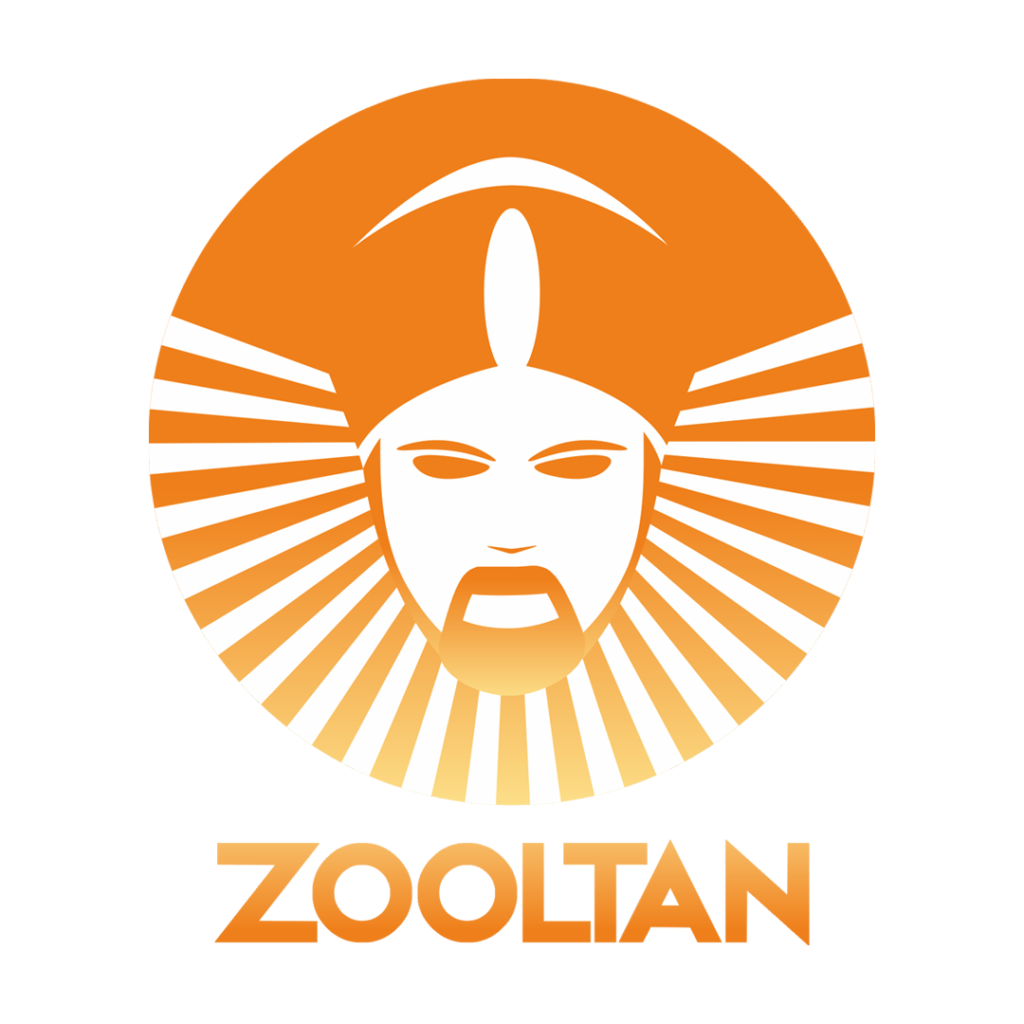
Zooltan, first of a kind App based Logistics company sought a logo that embodied a traditional feel to the new brand, akin to the iconic Starbucks logo. The founder envisioned a “Sulthan”-like figure that symbolized strength, leadership, and the regal qualities hence their name, Zooltan. This branding was to be applied consistently across their fleet, packaging, signage, and mobile app.
The brief was to keep it simple, graphical, clean and to make people feel familiar with the logo, riding off the starbucks feel
The Design
We focused on developing a clean graphical logo that married traditional and modern elements unlike the starbacks logo yet retaining core idea. The central figure was a regal “Sulthan” character, framed within an emblematic circle to convey authority and trustworthiness, much like the Starbucks layout. The intricate details in the design reflected the regal essence, while clean lines and bold typography kept it adaptable for various mediums.
The Application
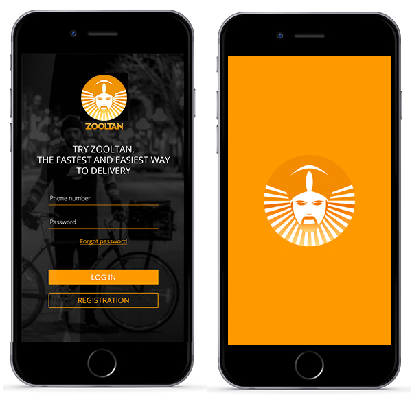
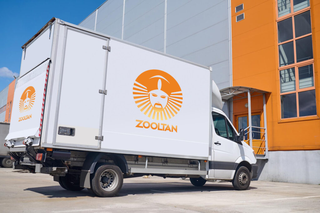
The finalized logo was aimed to seamlessly incorporate across:
Mobile App A clean, simplified version of the logo for digital platforms, ensuring recognizability and consistency
Fleet Vehicles Large-scale decals for a commanding and professional appearance on the roads.
Packaging Sleek and modern packaging for logistics materials, with clear and impactful branding.
Signage: High-visibility signs for office locations and warehouse spaces..